Background
Before getting into the details, I would like to share the story behind Rear-Display Sticky Notes.
Xiaomi's 2025 digital-series flagship launch event was scheduled for September 25. As usual, Xiaomi CEO Lei Jun tried out the new phone one to two months before the event and worked with the marketing team to identify the key features to highlight. On August 11, a few days after Lei Jun's meeting with the marketing team, we received a request for an entirely new feature. It could be summarized in just two sentences:
- Let users "pin" important information to the rear display so they can check it at any time.
- Make the animations cool.
At that point, there were 6 weeks and 3 days left until the launch event: 45 days, or 34 working days. In that time, we had to complete product design, UI design, motion design, visual-effects design, engineering integration, testing, and release.
Design Approach
Generally speaking, a good design should have a good story behind it. But 34 working days left no time to craft one; we had to use every trick we knew and sprint toward delivery from day one.
Fortunately, the requirements were not particularly complex. The entire product followed a single linear flow with the following steps:
Since there was no time to craft a story, the overall design approach was to show users exactly what was happening underneath: what you see is what you get.
1. Selecting Content
Content selection was handled by an upstream team, so I did not need to worry about it at this stage.
2. Content Recognition
The first idea was to "peel" the selected content off the screen and "stick" it onto the rear display. I quickly implemented the following effect using a vertex shader. The image changed color as it deformed, and the peeling position corresponded to where the finger tapped. However, the final release did not use this sequence; I will explain why later.
3. Composing the Rear-Display Image
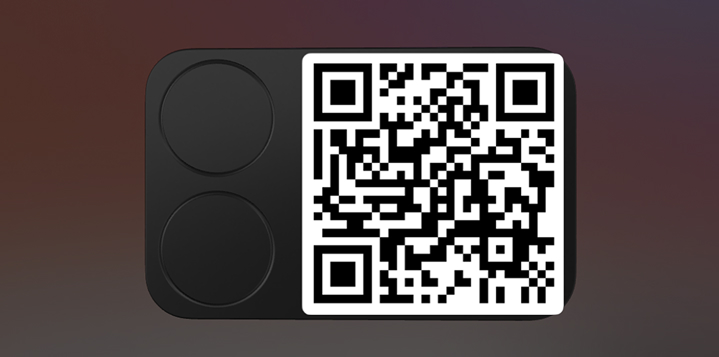
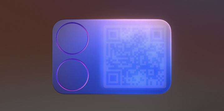
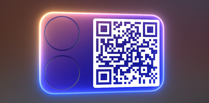
Since the feature was called "Sticky Notes," the natural choice was to turn the image into a card. I used the hardware AA texture to build a card model. The Super Island effect for device notifications has a glowing outline. Following the principle that an object should retain a visual connection to where it came from, I added a glowing edge to the card model as a cue for visual continuity.
4. Displaying It on the Rear Screen
The rear display is on the back of the phone, so I made the card rotate around and hide behind the camera as it exited. This allowed it to connect naturally with the subsequent device notification.
5. Connecting Everything with Animation
After adding physical collisions, lighting effects, color, and animation, I completed the basic prototype—or rather, the storyboard—within 48 hours.
Design Iterations
1. Fast Iterations
Once the basic framework was in place, I could refine each element in detail.
- Baseline version
- Adjusted animation curves
- Refined the card model
- Improved the bloom implementation
- Added a blurred entrance effect for the card
- Added a light-diffusion effect
- Removed the peeling effect to preserve a sense of force
- Replaced the compute pipeline with a render pipeline
- Removed the dynamic diameter of card-edge-mesh to fix antialiasing issues
- Increased Scene/Glow rendering resolution to improve antialiasing
- Used multilevel bloom + upsampling to improve antialiasing and visual quality
- Refined lighting materials
- Refined the environment map
- Tuned rendering parameters
- Refined the card's fly-in animation
- Refined the card dimensions
- Enabled MSAA to improve still frames and animation
- Added debanding
- Added support for fully laminated displays
- Refined the card's rounded-corner clipping animation
2. Card Model
I also put considerable thought into the structure of the card model. Small industrial-design techniques gave its reflections more variety and character. The camera area has two slopes with different gradients, creating more paths for light to reflect. The card edges are rounded as well, making highlights change more smoothly as the card rotates and giving it a more tactile quality.
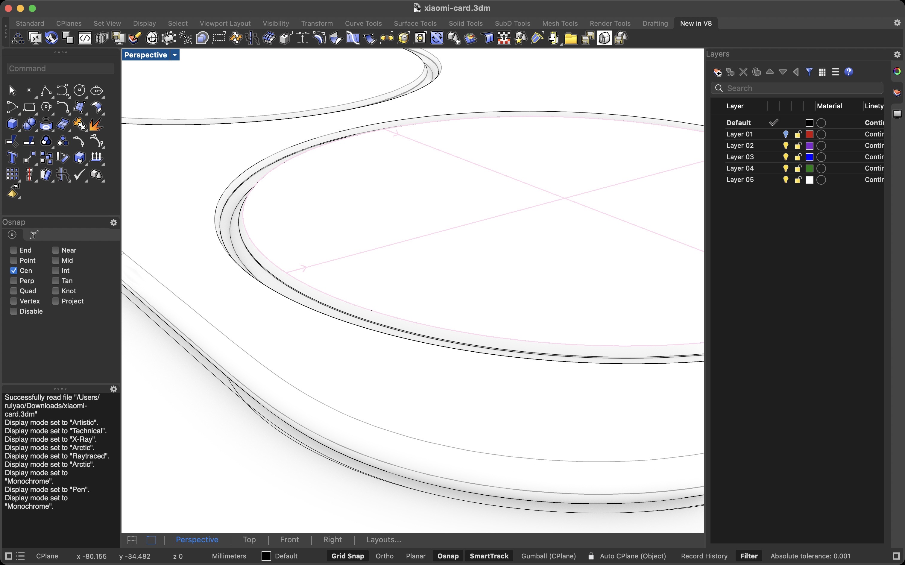
These rich details are visible in a supersampled Matcap preview in Blender, even though they may amount to only a few pixels in the actual scene.
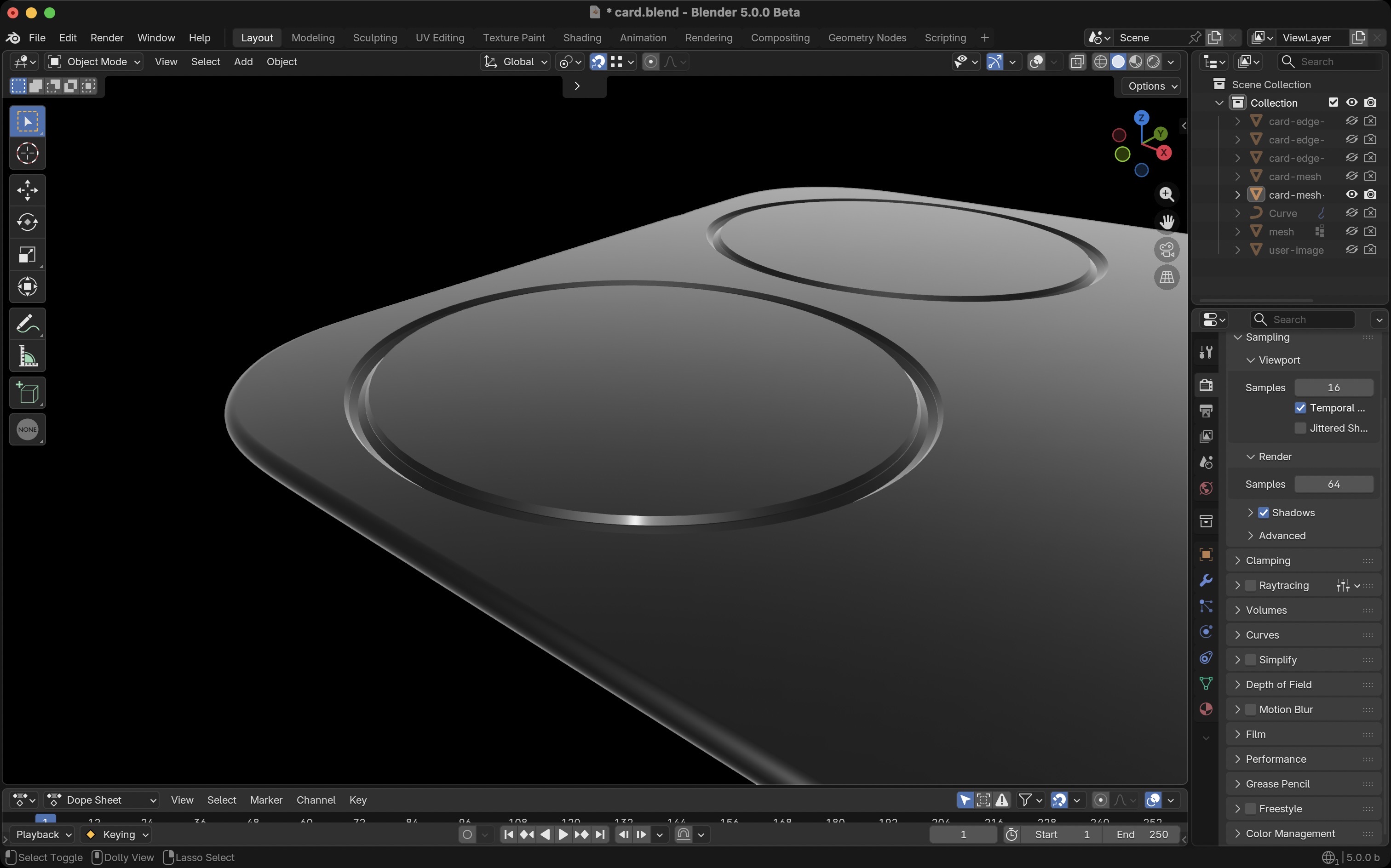
Sometimes I question whether users will really notice details smaller than one or two pixels. But as with luxury goods, taking care of every detail is part of taking users seriously.
3. Bloom
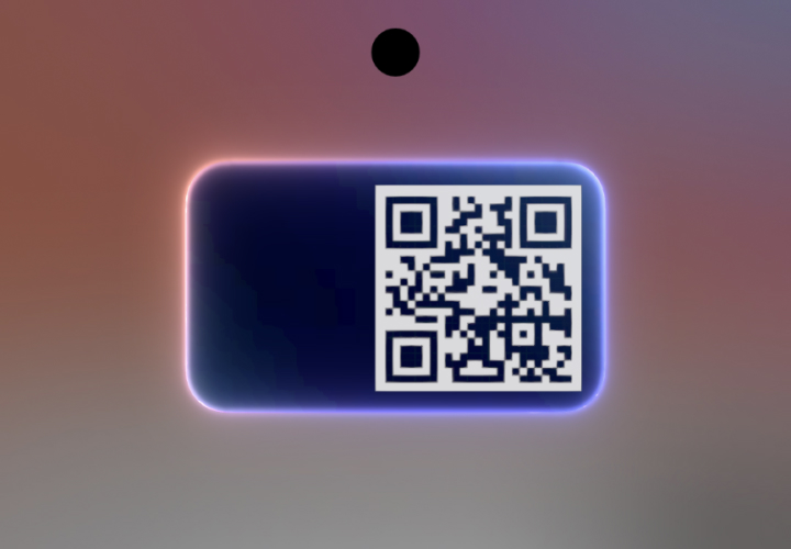
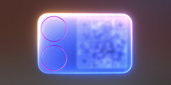
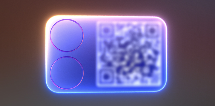
The glowing edge was the most important visual element. In the initial approach, I approximated bloom using a cubic-interpolation scheme based on gradient blur, taking mobile performance into account. However, this approximation was mipmap-based. Once the glow intensity increased, visible blocks of color appeared, making the glow look as if it were "floating" above the card rather than emanating from a light source.
AKG4e3 shared Unreal Engine's real-time bloom approach on Zhihu. In short, UE uses multiple stages of downsampling + blur + upsampling to produce a continuous, soft glow. The most valuable aspect of this approach is its ideal bloom brightness curve, which gives us a target for balancing performance and visual quality. The comparison below shows how the approach evolved. Refining the glow substantially improved the image's overall quality.
4. Real-Time Gaussian Blur
Real-time Gaussian blur has been an ongoing area of research within HyperOS for nearly four years. My deep involvement in that work gave me a body of technical experience that I could apply directly to this project. I cannot share the implementation details because of an NDA.
Pixel Perfect
Unlike games, UI interfaces have extremely demanding rendering-quality requirements. On one hand, handheld-device displays are exceptionally sharp, and users hold their eyes very close to the screen during everyday use; on the other, UI elements are stationary in most scenarios. These factors amplify visual artifacts. Aliasing, banding, and similar issues can severely damage the perceived quality of an interface.
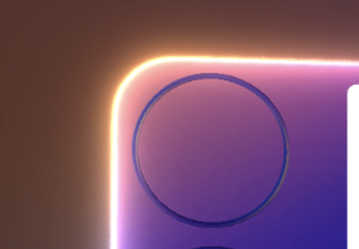
The design process therefore had to remain pixel perfect at all times. Experience from previous projects allowed me to combine multiple effects in a short time while maintaining exceptional visual quality. PBR, lighting, bloom, blur, color management, and more: every frame can withstand pausing, zooming in, and pixel-by-pixel inspection. That is the part I am most satisfied with.
You can also find the launch-event video and some product photos I took here.