项目信息
Project Info
| 团队规模 | 3 |
| 角色 | 设计工程师, 交互设计师 |
| 职责 | 负责HyperGrid, HyperCell, HyperFrame等组件的设计 |
| 持续时间 | 6 个月 |
| 平台 | HyperOS 2.0 |
| 技术栈 | FigmaReact |
前言
Introduction
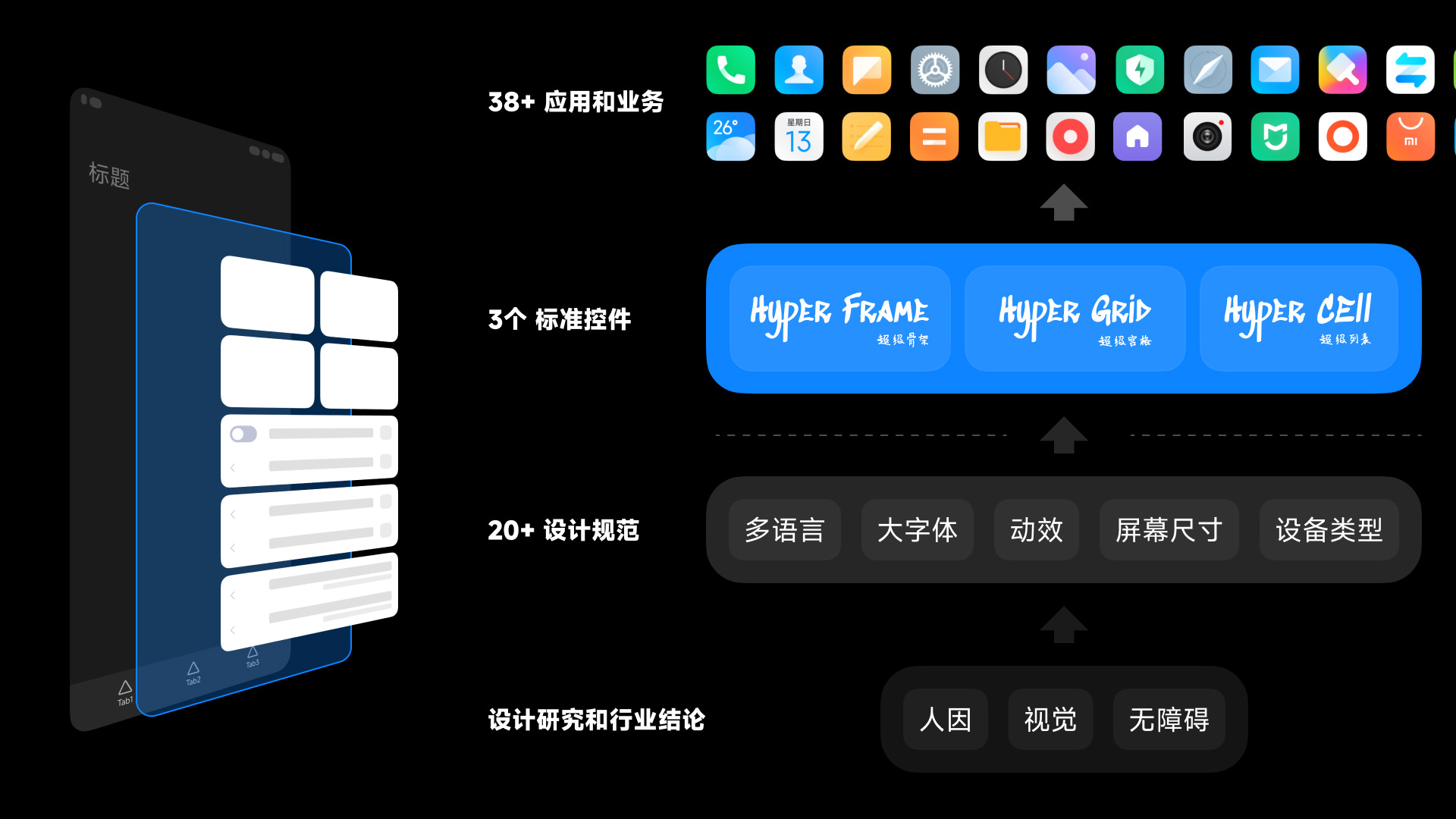
HyperOS 是小米公司的下一代操作系统,为了适应不同屏幕尺寸、分辨率、设备类型,我们设计了一套全新的、打通全流程的自适应设计系统和SDK。 设计系统包含的内容十分庞杂,包括导航模式、颜色、字体、图标、间距、布局、圆角、阴影,常用控件等。
HyperOS is Xiaomi's next-generation operating system. In order to adapt to different screen sizes, resolutions, and device types, we have designed a brand new, end-to-end responsive design system and SDK. The content of the design system is very complex, including navigation mode, color, font, icon, spacing, layout, rounded corners, shadows, common controls, etc.
这里我们将以导航控件中的文字容器尺寸和间距为例,展示设计系统的设计思路和实现方法。
Here we will take the spacing between text containers in the navigation control as an example to demonstrate the design ideas and implementation methods of the design system.
设计思路
Principles
1. 防误触
1. Anti-mistouch
目前搭载 HyperOS 系统的设备类型主要有三类:手机、折叠屏和平板。
There are mainly three types of devices that carry the HyperOS system: mobile phones, foldable screens, and tablets.
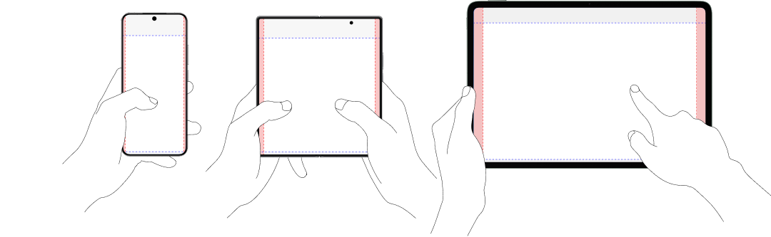
这三种设备分别对应了三种用户使用场景,分别对应了三种不同的防误触边距。
- 手机 -> 单手手持 -> 16px
- 折叠屏 -> 双手手持 -> 24px
- 平板 -> 单手手持/放置 -> 40px
These three types of devices correspond to three different user usage scenarios, each corresponding to three different anti-mistouch margins.
- Mobile phone -> single-handed holding
- Foldable screen -> two-handed holding
- Tablet -> single-handed stationary
2. 距离及视锥角
2. Distance and FOV
用户在使用三种不同的设备时,因为眼睛距离屏幕的距离不同,可视区域也会有所不同。
When users use three different devices, the distance between their eyes and the screen is different, and the field of view will also be different.
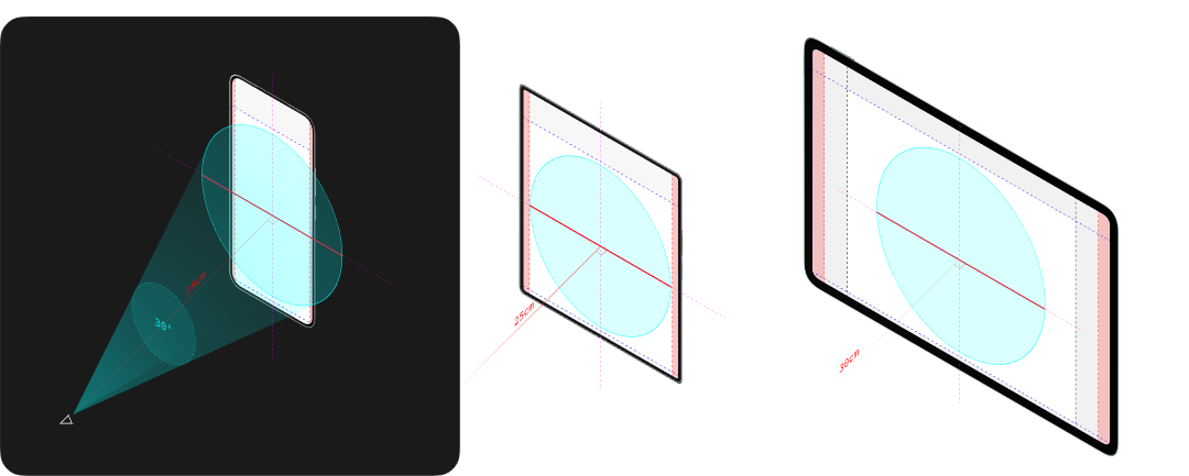
人类的视锥角一般认为是30°
对于手机和折叠屏,用户的视锥角足够覆盖整个屏幕,因此内容区域的宽度在刨除防误触边距后,可以占据屏幕的100%。
而对于平板,用户的视锥角无法覆盖整个屏幕,因此内容区域的宽度应当适当缩小,以保证用户不需要挪动头部即可看到整个屏幕。
The human field of view is generally considered to be 30°.
For mobile phones and foldable screens, the user's field of view is enough to cover the entire screen, so the width of the content area can occupy 100% of the screen after excluding the anti-mistouch margin.
For tablets, the user's field of view cannot cover the entire screen, so the width of the content area should be appropriately reduced to ensure that users can see the entire screen without moving their heads.
总结
Summary
HyperOS 的设计系统承载了 100+ 个一方及三方业务。因此设计系统需要抓住一切问题的本质,从根源出发识别并解决问题。 这个设计理念贯穿于设计系统的 20+ 个控件的每一个细节。
The design system of HyperOS carries 100+ first-party and third-party Apps. Therefore, the design system needs to grasp the essence of all problems, identify and solve problems from the root cause. This design concept runs through every detail of the 20+ controls in the design system.